After 10 Years, Google’s ‘G’ Logo Just Got a Modern AI Makeover
 TECH
TECH
The tech giant introduces a sleeker, gradient-style logo to reflect its AI-first future.
New Delhi: For the first time in almost a decade, Google has updated its legendary ‘G’ logo, revealing a fresh redesign that encompasses the new identity of the company in the age of artificial intelligence (AI). The adjustment comes just days before the highly anticipated Google I/O 2025 developer conference, which begins on May 20.
What’s New in the Logo?
The new ‘G’ logo replaces Google’s traditional flat, block-style colors with a flowing gradient that seamlessly combines blue, red, yellow, and green. The gradient effect gives the logo a softer, more dynamic look, designed to be optimized for high-resolution screens and digital environments.
While the shift might be subtle at first glance — particularly on the smaller sizes — it represents a shift in Google’s design language and branding strategy on a larger level.
Where Can You Find the New Logo?
The new logo is currently being rolled out selectively:
iOS devices: Downloadable through the current version of the Google Search app.
Android devices: On Pixel phones and through the Google app beta version 16.18.
Other platforms: The older logo can still be seen on the majority of non-Pixel Android phones and web browsers.
Google has not yet released a formal rollout schedule, but the update should appear on more devices in the next few weeks.
Echoing Google’s AI Push
The logo update goes beyond a superficial change. It reflects Google’s growing emphasis on artificial intelligence, especially as the increasing visibility of Google Gemini, the company’s AI assistant, comes into focus. Gemini itself is already employing a gradient-style design—mostly blue and purple—so it makes sense that the new ‘G’ logo would seem more in line with the brand’s AI-driven environment.
Design analysts posit that this visual shift is part of Google’s long-term vision to build a cohesive, AI-first brand across all its offerings.
What’s Staying the Same — For Now
To date, there are no updates to the entire “Google” wordmark or other app icons such as Chrome, Gmail, Maps, or Photos. Yet, design commentators surmise that upcoming updates may be in the works as Google further ties its visual identity with its AI vision.
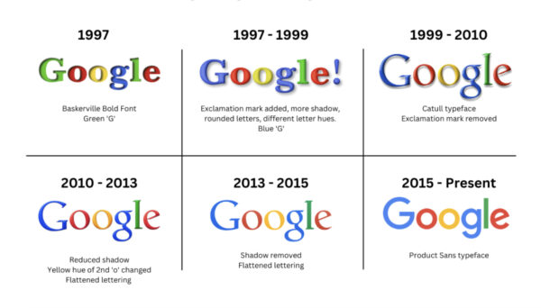
A Brief History of the Google Logo

1997: First Google Logo
Font: Baskerville Bold
Features: Green-colored ‘G’
Style: Serif font with a classic appearance
1997 – 1999: Introduction of Shadows and Exclamation
Added: Exclamation mark (inspired by Yahoo!)
Design: More shadow, rounded letters
Color Change: ‘G’ changed to blue
1999 – 2010: Cleaner Typeface
Font: Catull typeface
Removed: Exclamation mark
Style: More refined and modern serif look
2010 – 2013: Flattening Begins
Shadows: Reduced
Color Tweak: Yellow hue of the second ‘o’ adjusted
Style: Move toward flatter design for modern screens
2013 – 2015: Flat Design Adopted
Shadows: Completely removed
Style: Fully flattened letters, cleaner appearance
2015 – Modern, Sans-serif Identity
Typeface: Product Sans
Look: Simple, geometric sans-serif design
Marks: Significant shift to a modern digital identity
2025: Addition of the gradient-style ‘G’ logo to align with AI-based branding.
As Google moves ever further into the AI and digital helper space, this logo refresh is probably just the start. Users can look forward to a more unified, smart, and visually up-to-date experience as part of Google’s future.
Has the new logo appeared on your device yet? What do you think?
Also read: Call Grows for Mandatory Proof of Reserves for Indian Crypto Exchanges
